HMI (Human Machine Interface) not only simply displays information but also helps operators quickly understand complex data thanks to Data Visualization. Data visualization helps turn dry numbers into vivid charts and dashboards, supporting real-time monitoring, detecting abnormalities and making timely decisions. So what is Data Visualization in HMI, what are the benefits and what should be noted when designing? Let’s find out with XINJE now!
What is Data Visualization in HMI?
Data Visualization is the process of turning dry technical data and numbers into visual, easy-to-understand images such as charts, graphs, gauges, index tables or dashboards.
In the field of HMI (Human Machine Interface), Data Visualization allows real-time data display from machines, sensors, measuring devices, helping operators monitor and make quick decisions.
Advanced visualization goes beyond just “displaying”, and also arranges data into dynamic charts, KPI index tables, or dashboards — allowing users to compare, contrast, and analyze real-time or historical data.
Thanks to that, operating engineers do not need to read a series of numbers but still understand the whole picture of the production line through just one screen.
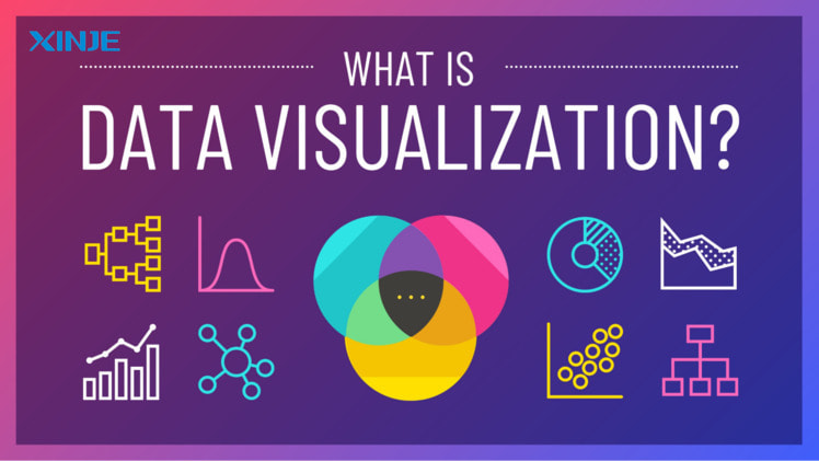
What are the benefits of Data Visualization in HMI automation?
In an automated production environment, the volume of technical data generated every day is often very large and complex. Thanks to Data Visualization, these dry numbers are “translated” into easy-to-see images and charts, bringing many practical benefits:
- Help operators quickly understand complex data: Instead of having to read long series of numbers, engineers only need to observe charts, gauges or index tables to grasp the status of the machine immediately.
- Support for detecting abnormalities and early warnings: Trend charts and color indicators help to recognize signs of abnormalities or incidents exceeding the threshold, thereby giving timely warnings.
- Coherent real-time data monitoring: Data Visualization in HMI allows continuous monitoring of important parameters, ensuring stable production processes.
- Trend analysis to optimize the line: Historical information is visually represented to help engineers easily analyze, detect patterns, thereby making adjustments to save costs and improve productivity.
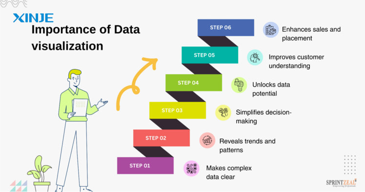
What are the popular Data Visualization tools in HMI?
To visualize data effectively, HMI systems often integrate many modern visualization tools, suitable for the characteristics of each production process:
- Intuitive Dashboards: Gather all important information on a single screen, helping operators easily grasp the overview of the chain status.
- Trend Graphs: Display real-time data in the form of lines, columns or areas to monitor fluctuations in key parameters such as pressure, temperature, speed.
- Dynamic KPIs: Key Performance Indicators are presented directly and continuously updated to assess the level of achievement of production goals.
- Widgets displaying device status: Status boxes, indicator lights, device icons help quickly identify which elements are operating, paused or having problems.
- Visual warning system: Use colors, sounds or flashing icons to attract attention when errors occur, ensuring timely and safe handling.
How to design effective Data Visualization?
To maximize the value of Data Visualization in HMI, it must not only be beautiful but also practical, easy to understand and suitable for operators. Some important principles when designing are as follows:
- Minimalism – display correctly and sufficiently: Data visualization does not mean putting a lot of information on one screen. Only select important data, arrange it scientifically to avoid confusion and reduce unnecessary operations.
- Choose the right type of chart: Each type of data has a suitable type of chart. For example: use a line chart to show a change trend, use a bar chart to compare multiple items, use a gauge or digital clock to display threshold values.
- Consistent color coding for warning levels: Colors help distinguish operating status (normal, warning, serious error). The design needs to be consistent, easy to recognize and have enough contrast to be clearly visible in factory conditions.
- Ensure interactivity: Effective visualizations are more than just static displays. Modern HMIs often support zooming, filtering, or drilling down so users can dive into detailed data without wasting time searching.
- Compatible with multiple HMI screen sizes: Visualizations need to be tested to display well on different types of HMI screens, from small touch panels at machines to overview dashboards in control rooms. Responsive interfaces allow for more flexible operations.
What are the common errors when implementing Data Visualization?
Despite the many benefits, implementing Data Visualization in HMI also has many potential risks if not carefully designed, programmed and tested:
- Data overload, confusing dashboard: Many systems try to display too much information on one screen, making it difficult for operators to follow, lose focus and easily miss important data.
- Slow, asynchronous data updates: If the data transmission speed from sensors, PLCs or SCADA systems is unstable, charts and dashboards are prone to freezing or displaying incorrect data, causing confusion during operation.
- Difficulty for users to understand the meaning of charts: Complicated chart designs, using inconsistent symbols, colors or information can easily make it difficult for new employees to access, requiring more training time.
- Lack of appropriate access leads to poor security: Visualization often displays sensitive data. Without clear authorization, unauthorized people can also access and edit parameters, potentially posing risks to the entire chain.
What are the tips to optimize Data Visualization for HMI?
To maximize the power of Data Visualization in HMI, businesses and engineers need to note the following tips:
- Always consult feedback from operators: They are the ones who use the interface every day, understand the actual operations, and thereby contribute ideas to improve the dashboard more appropriately.
- Organize a clear, logical layout according to the process: Arrange charts and indicators in order of the operating flow to reduce searching operations, save time and avoid incorrect operations.
- Set appropriate color warning levels: Specify intuitive, consistent colors for each state (normal, warning, serious error) for users to easily identify immediately.
- Test on multiple devices before deployment: Visualization needs to display well on HMI screens, computers, and even mobile devices if integrating IIoT. Cross-platform testing helps limit display errors and lag.

Conclusion
It can be seen that Data Visualization plays a key role in improving the monitoring and operating efficiency of modern HMI systems. Data visualization helps turn dry technical numbers into easy-to-understand information, helping operators detect abnormalities, make quick decisions and optimize production processes.
To maximize the benefits, businesses need to design simple, logical, multi-device compatible Visualization and always focus on user experience.
An HMI system with smart Data Visualization will be the key to helping factories operate more safely, transparently and sustainably in the era of automation.